Client
Client work
Year
2025
Project type
Visual Identity Design
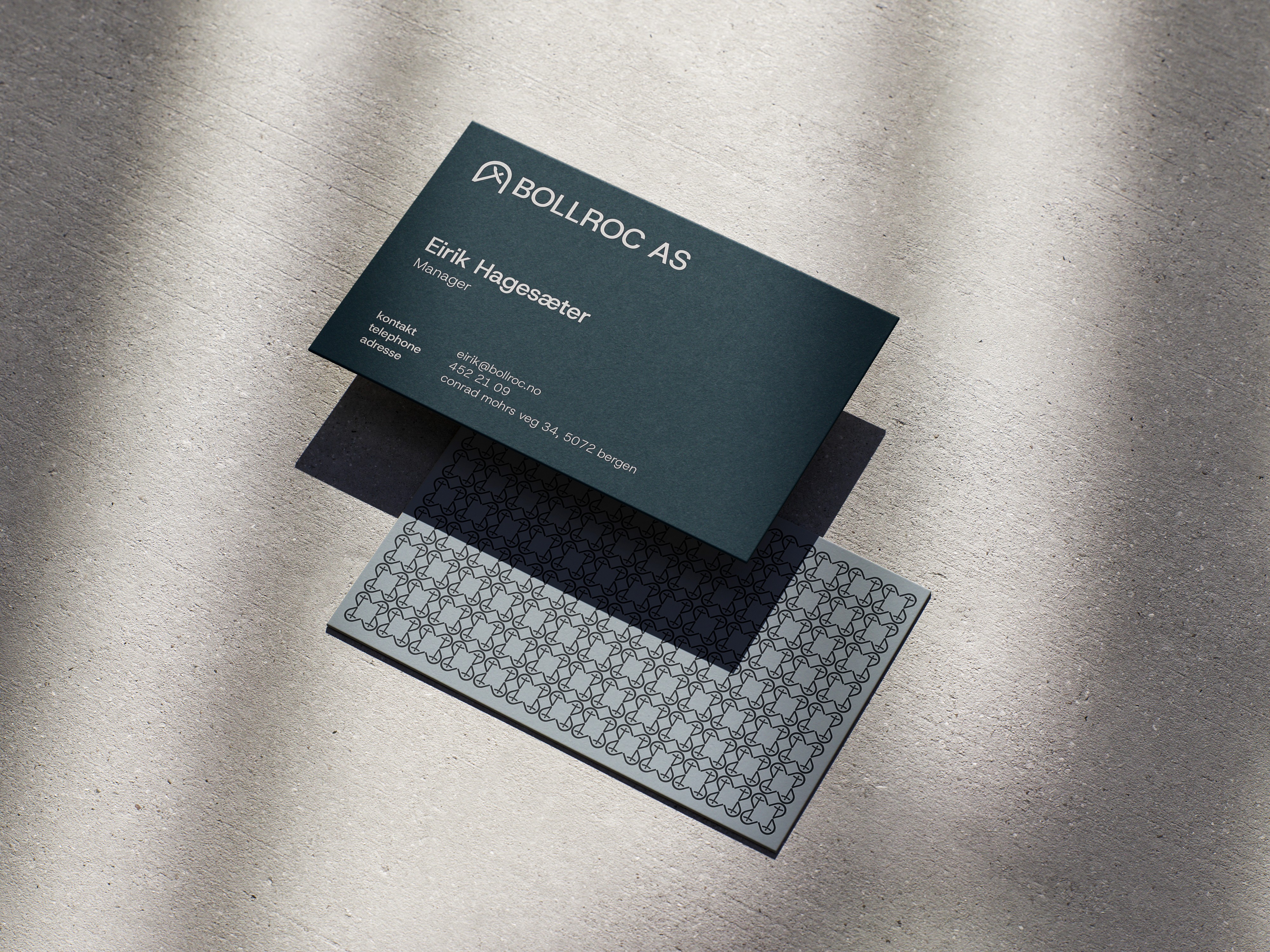
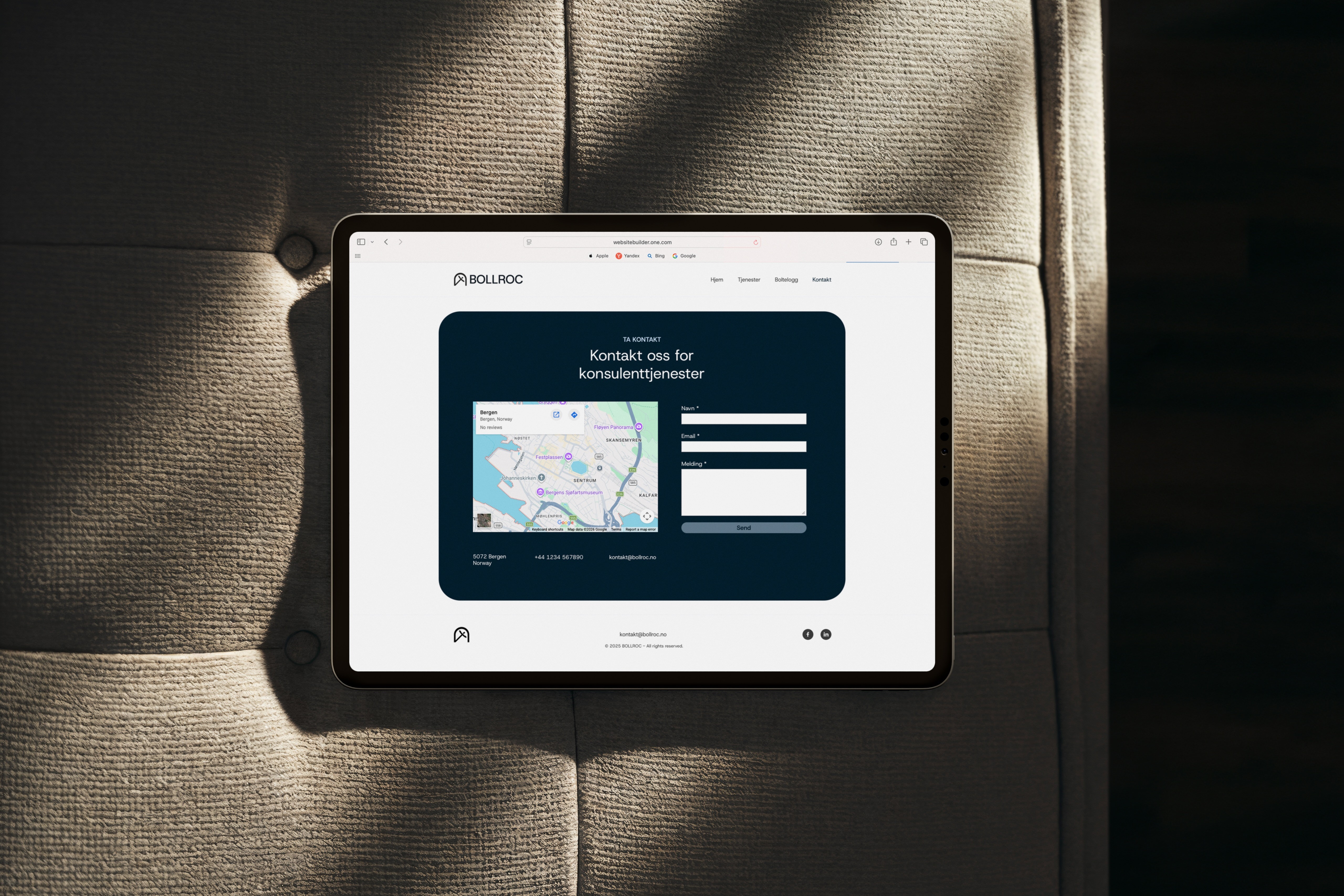
Brief A tunnel engineering consultancy needed a visual identity that communicated technical credibility and differentiated them from larger, more generic competitors in the industry. Approach The core symbol merges a tunnel arch with a simplified bolt, using negative space to create depth without sacrificing clarity, a mark that works at any scale. A restrained monochromatic palette and the geometric sans-serif Host Grotesk reinforce precision and professionalism without feeling corporate or cold. Solution A scalable brand system built for both digital and print applications, from business cards and documents to signage and digital profiles. Every element earns its place: no decorative choices, only decisions that reinforce the firm's positioning around trust, accuracy, and straightforward expertise.